Behind the Brand: The Making of StraitsX’s New Look

Last week, we introduced StraitsX 2.0 to the world, a refreshed brand identity designed to reflect who we are today and where we are heading.
The reaction from our partners and community has been incredible, but now that the reveal is behind us, we wanted to pull back the curtain and share the story of how we built this new visual identity.
This is not just a new look. It was a strategic redesign that reflects StraitsX's evolution from a regional stablecoin platform to a global, institutional-grade payment infrastructure with compliant, accessible, and always-on stablecoin rails.
Over the past few years, the role of stablecoins has shifted dramatically. Once seen as a niche experiment, stablecoins have now reached a market capitalisation of over $238 billion, becoming core to how value moves across digital and traditional rails.
StraitsX has been at the forefront of this shift. To date, we’ve powered over $10 billion in on-chain settlements, built critical infrastructure connecting centralised and decentralised finance, and worked with institutional partners to unlock real-world use cases for tokenised currencies.
But our original brand, while effective in the early days, no longer reflected our scale or ambition.
Evolving with Purpose
Our previous brand identity served us well in capturing the spirit of our early days as a pioneering platform in the stablecoin space. However, as StraitsX matured, we also needed a new visual identity that reflected our role in the industry.
- Visual Evolution: Our previous identity leaned heavily on Web3-native aesthetics, characterised by bright, playful, and informal elements. But our client base has evolved from crypto startups to regulated institutions and payment providers. These audiences expect clarity, credibility, and professionalism.
- Expanding Our Reach: We have outgrown our regional positioning. No longer just a SEA payment infrastructure, StraitsX has become a global infrastructure layer powering APIs, FX, tokenised currencies, and regulated settlement globally.
- Sharpening the Narrative: As our solutions matured, so did our positioning. We have always played a critical role as the bridge between traditional finance and digital assets. Our refreshed design now better reflects that role, aligning with the growth of stablecoins from experimentation to institutional use cases.
- Designed for Institutions: With over $10 billion in on-chain stablecoin settlement volume and deep partnerships across various industries, we have built a platform ready for institutional-grade finance. Now with a brand identity that reflects the same rigour of trust and scalability embedded in our infrastructure.
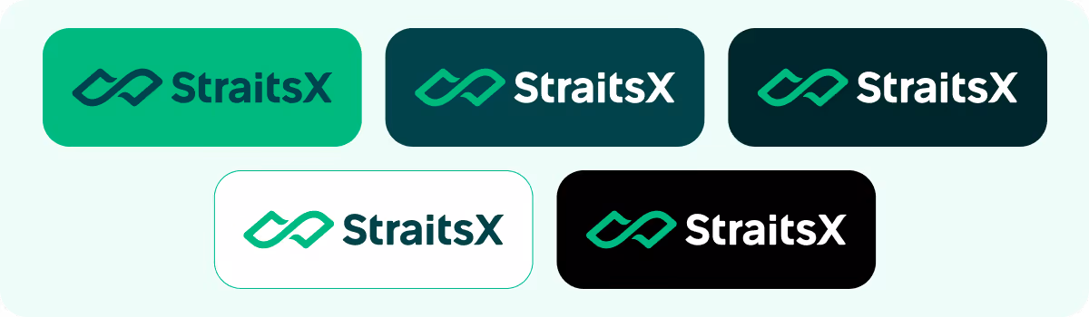
Building the New Identity
The Logo Mark
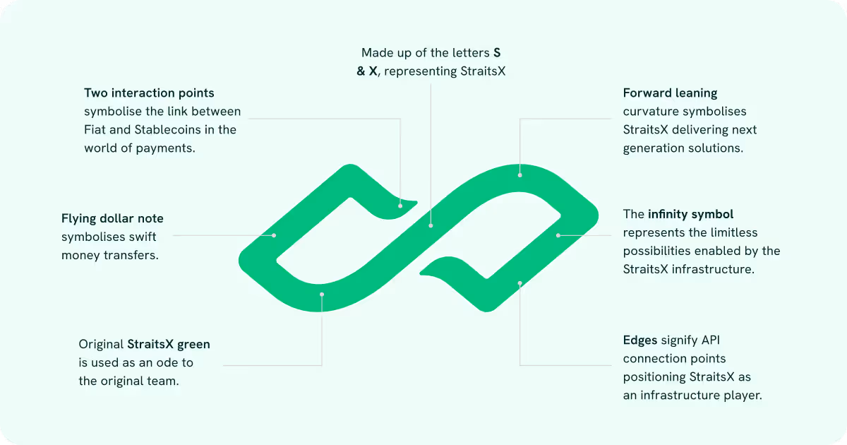
At the heart of our new identity is a reimagined logomark that captures our essence and ambition:
- The design reimagines the letters “S” and “X” within an infinity symbol, representing both our name and the boundless possibilities of stablecoin-powered payment settlement rails.
- The curved, forward-leaning shapes convey seamless integration, secure flows, and forward progress—three principles at the core of our infrastructure.
- A subtle reference to a flying dollar note alludes to the swift movement of funds, real-world payments powered by stablecoin rails.
When merged, they create a visual equation that tells our story of enabling boundless financial infrastructure for real-world payments. It is a symbol that works as both a mathematical construct and a visual shorthand for trust and innovation.

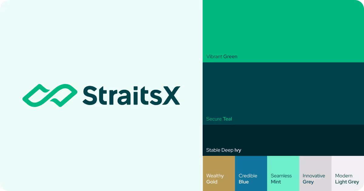
The Colours
We retained our signature green, evolving it into Vibrant Green, paired with Secure Teal and Deep Ivy for stability and depth.
- Vibrant Green serves as the brand’s signature colour, embodying growth and clarity
- Secure Teal, a grounding tone symbolising security and trust.
- Stable Deep Ivy introduces a deep, near-black shade with green undertones, providing depth and stability to the palette.
- The secondary colour palette can be used as accent colours to add interest to the brand applications and amplify the brand positioning.
The new colour system was carefully designed to communicate the duality of innovation and trust, which are qualities essential for financial infrastructure.
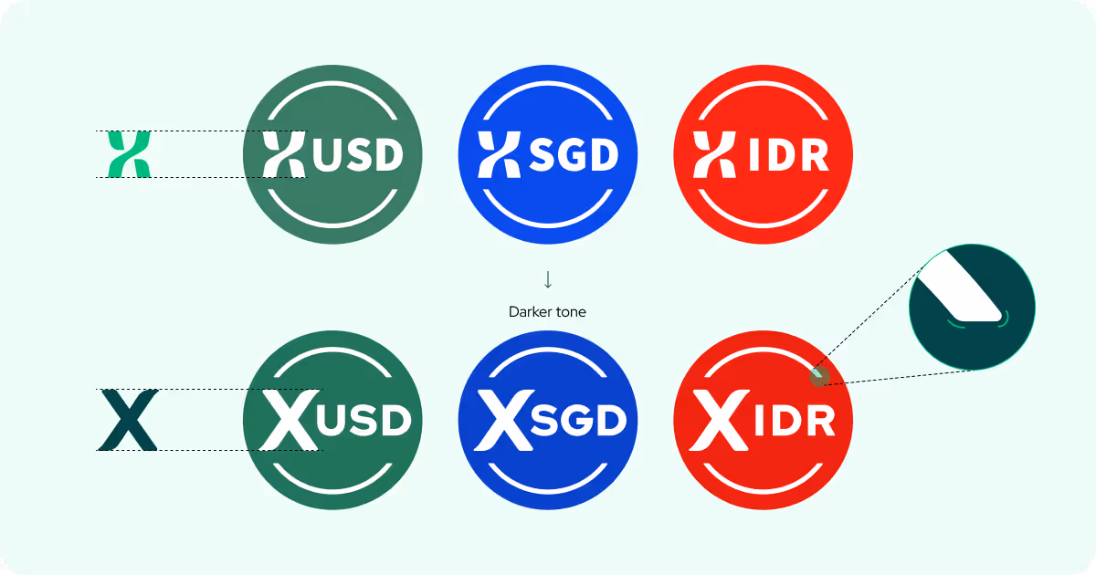
Our Stablecoins
The StraitsX stablecoins — XUSD, XSGD and XIDR have also received a design upgrade. We refined their visual framing to reflect their status as regulated, institutional-grade digital currencies. Circular framing and stronger visual architecture give them weight and consistency.
The prominent “X” prefix now clearly ties each currency back to the StraitsX infrastructure, reinforcing that they are not isolated tokens but part of an integrated, trusted settlement network.
Built for What Comes Next

This brand refresh arrives at a pivotal moment: stablecoins are becoming the default settlement layer of the digital economy, driven by clearer regulations, growing institutional demand, and real-world adoption.
StraitsX 2.0 is already in motion. While others look ahead, we have quietly built the rails that the future of global payments depends on. To date, ur trusted infrastructure powers over $10 billion in on-chain settlements, supporting enterprise-grade APIs and enabling regulated stablecoins to move securely across borders.
Just as a strait connects two vast bodies of water, StraitsX bridges the great disconnect between traditional finance and the crypto-native world. This refresh is more than a new look. It is a reaffirmation of our role as the connective layer in this new era of money movement. We are delivering stablecoin rails for the world to settle the future of payments securely, at scale, and ready for what’s next.
Related Post
